



1995
DUNN-EDWARDS COLORS OF THE DECADES
DECADES COLOR PALETTE
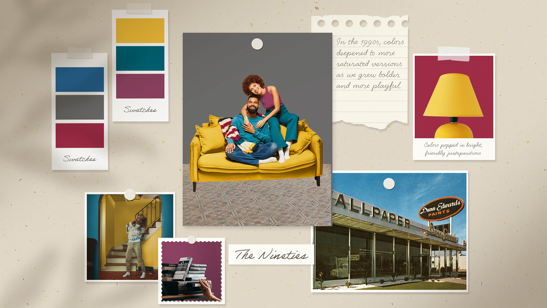
The 1990s were a time of transition, leaning away from the bright colors of the previous decade and towards a darker, more saturated aesthetic. Homes took on a more eclectic vibe, and deep colors like teal and plum made great backdrops for displaying collected objects. This color palette, paired with warm wood tones and varied textures, reminds us of a time of hanging out with friends and listening to our favorite grunge band.
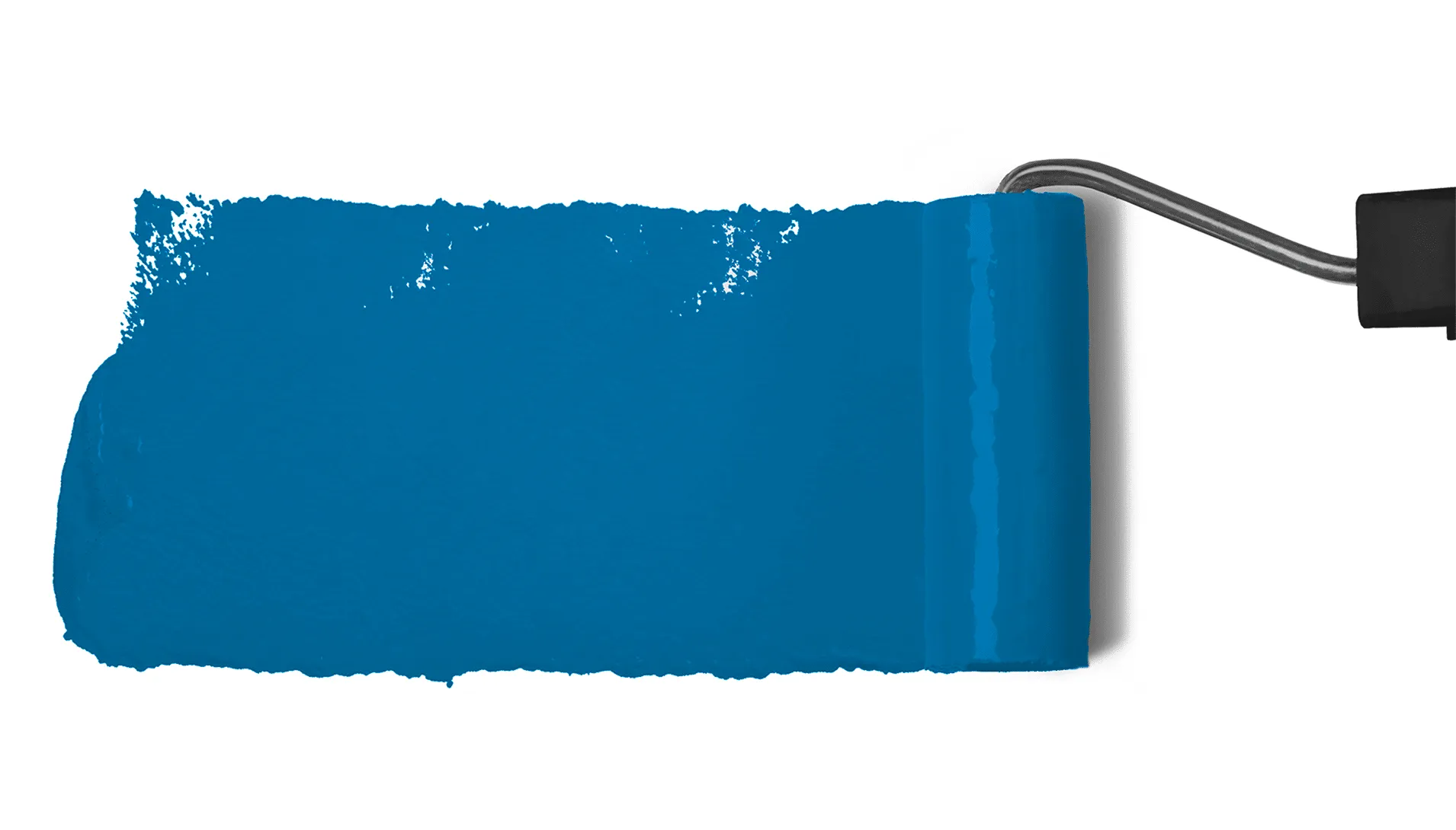
6 colors
1995 DECADES BLOG
Explore the moody shades of the 1995 color palette and add a little eclectic nostalgia from this era to your space.
READ ON about Explore the moody shades of the 1995…
What defines a 1990s-inspired color palette?
A 1990s palette leans toward rich, saturated hues like Aquatic (DEA134) and Putnam Plum (DEA100), paired with warm wood tones and layered textures. The result is an eclectic, lived-in feel that’s full of personality.
Why were darker, deeper colors so popular in 1990s interiors?
Deeper shades like Boat Anchor (DE6377) and Putnam Plum (DEA100) created a cozy, grounded atmosphere and served as a strong backdrop for art, books, and collected objects. They made rooms feel personal and stylish at the same time.
How do I style a room to capture the 1990s aesthetic?
Start with a saturated wall color like Aquatic (DEA134) or Crimson Strawberry (DEA102), then layer in warm woods, tactile fabrics like velvet or woven textiles, and curated decor. The goal is a space that feels collected over time, not perfectly matched.
Can I bring this look into a modern home without it feeling dated?
Yes. Use one bold hue — like The Blues (DE5859) or Boat Anchor (DE6377) — on a single accent wall or built-in, keep furnishings simple, and let texture do the heavy lifting. That balance gives you a nostalgic nod that still feels fresh today.