



1965
DUNN-EDWARDS COLORS OF THE DECADES

DECADES COLOR PALETTE
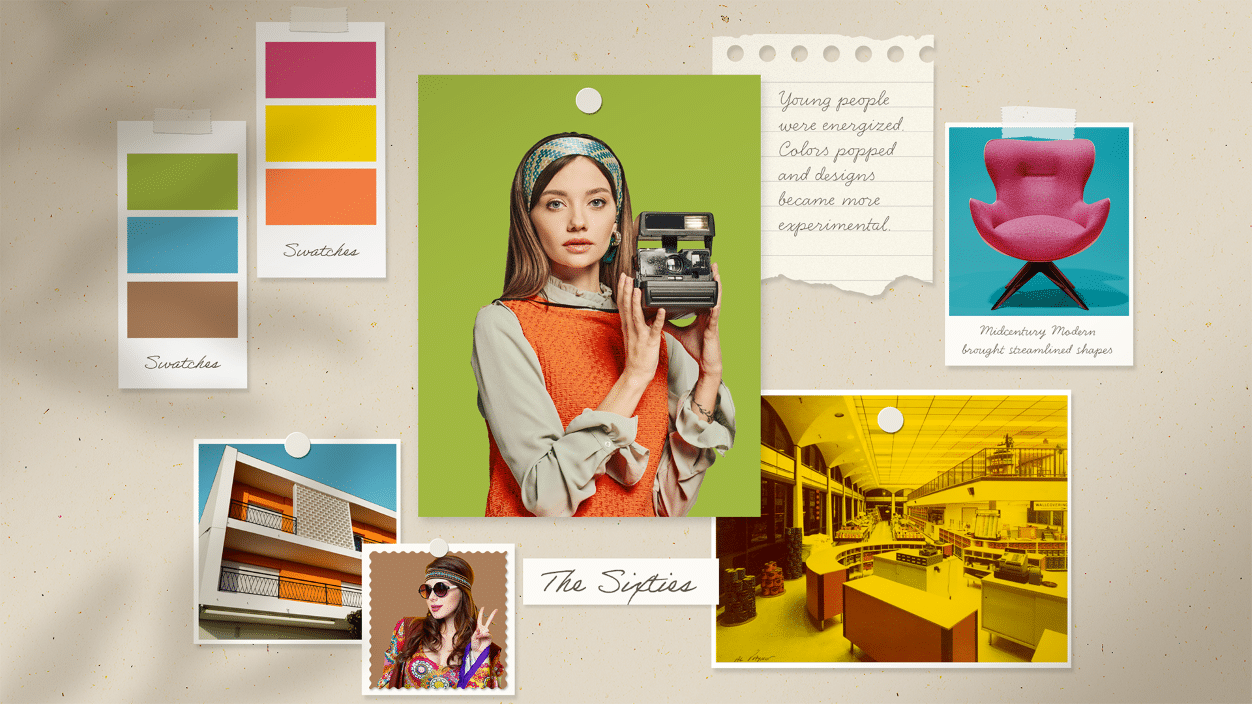
The 1960s were a vibrant era of social change and cultural transformation, bursting with a psychedelic explosion of color and creativity. This decade embraced bold, saturated colors like orange, green, and magenta, often combined with psychedelic patterns and tie-dye techniques.
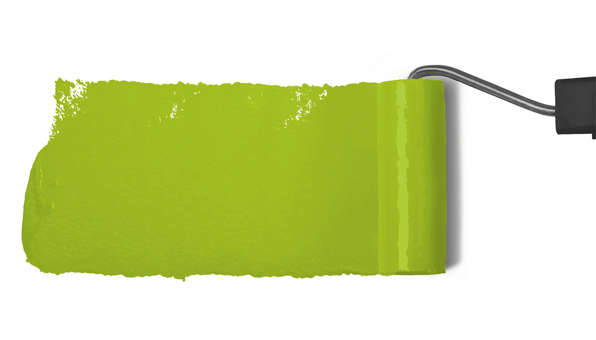
6 colors
1965 DECADES BLOG
Explore the bright, earth-inspired hues of the 1965 color palette to add a touch of retro to your space.
READ ON about Explore the bright, earth-inspired hues of the… (opens in a new tab)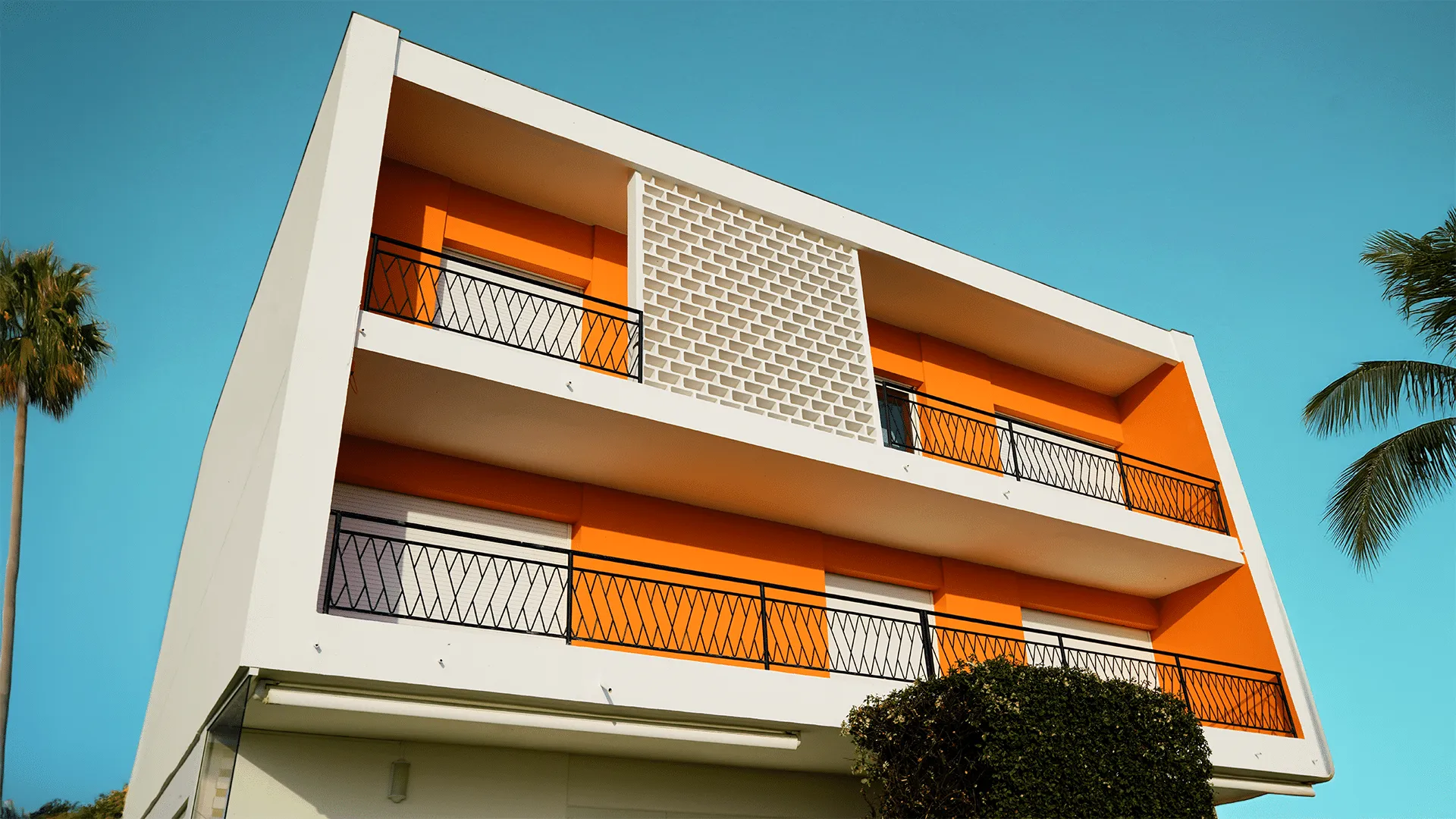
What Defines the Color Palette of the 1960s?
The 1960s were all about bold, fearless color. The decade embraced saturated, high-energy hues that reflected a spirit of change and creative freedom. Think warm oranges, vibrant pinks, and earthy reds — shades that made a statement and turned everyday spaces into something unforgettable. A color like Pink Punch (DE5048) captures that playful confidence perfectly, bringing the decade’s signature energy into any modern room.
How Can I Bring a Retro Feel Into My Home Without Going Overboard?
Start with one strong color and build around it with neutrals. A single accent wall, a painted piece of furniture, or a bold front door can do a lot of work without overwhelming the space. Summer Sun (DE5405) is a great place to start — it’s warm and welcoming, and it pairs beautifully with crisp whites and natural wood tones for a look that feels retro but still fresh.
Which Rooms Work Best With Bold, 1960s-Inspired Color?
Almost any room can handle a bold retro color when it’s applied thoughtfully. Kitchens, entryways, and bathrooms are great starting points because they’re smaller and easier to commit to. In the Tropics (DEA125) works especially well in living spaces or bedrooms where you want a grounded, lively feel. Pair it with cane, brass, or warm cream tones to complete the look.
How Do I Balance Vibrant Colors So They Don't Clash?
The key is to let one color lead and keep the rest of the palette simple. If you choose a bold anchor shade, support it with muted neutrals and natural textures rather than competing brights. Riviera (DE5753) and Roman Brick (DEC713) are a strong pairing — the cool blue steadies the earthy warmth of the red-brown, creating a balanced, sophisticated take on 1960s style.