



1945
DUNN-EDWARDS COLORS OF THE DECADES


DECADES COLOR PALETTE
The 1940s were characterized by muted colors, streamlined furniture silhouettes, and materials that reflected the resourcefulness of the era. The rich jewel tones in this color palette, paired with dark wood stains and sleek metal accents, embody a message of enduring strength during a difficult decade. Interior design of the time incorporated floral prints, often featuring mid-tone neutral colors, to soften the look of practicality in furnishings.
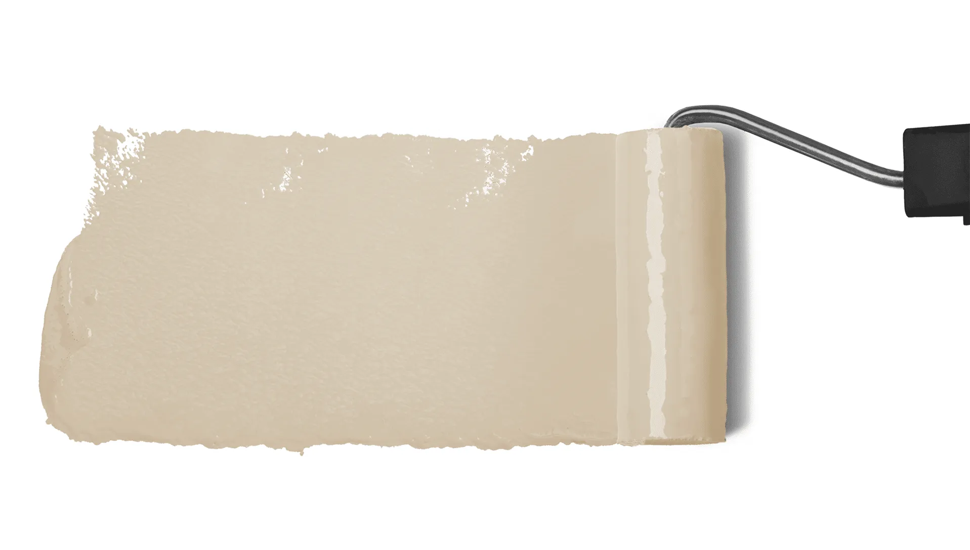
6 colors
1945 DECADES BLOG
Explore the classic and timeless feeling of the 1945 color palette and bring this vintage look into the new century.
READ ON about Explore the classic and timeless feeling of…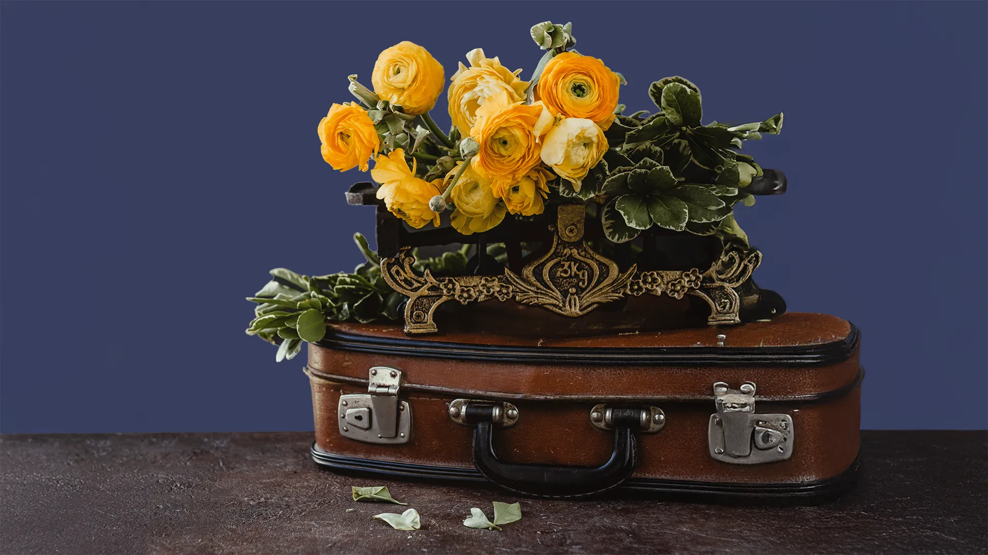
How Do I Choose a Main Wall Color for a 1940s-Inspired Room?
Reach for a soft, mid-tone neutral that reflects the era’s practical spirit, like Nomadic Taupe (DE6192) or Natural Bridge (DE6194). These grounded shades keep the room light and livable while setting the stage for dark wood, floral prints, and richer accents.
How Can I Add Jewel Tones Without Overwhelming a Space?
Start with neutral walls, then bring in one deeper shade through an accent wall, painted furniture, or built-ins. Huntington Woods (DET538) offers earthy green depth, while Singing the Blues (DET576) adds a calm, tailored richness that pairs beautifully with sleek metal accents.
What Color Works Best for a Bold Accent or Statement Piece?
Use a warm, spirited shade in small doses for the strongest effect. Red Craft (DET423) brings energy to a door or furniture piece, and Folklore (DET413) adds inviting warmth to an accent wall alongside dark wood stains.
How Do I Keep a 1940s Palette Feeling Warm and Inviting?
Layer softened neutrals with one richer tone, then finish with floral patterns, dark wood, and warm metal details. Natural Bridge (DE6194) creates a comfortable backdrop, while Folklore (DET413) adds the cozy depth that made this era feel strong and lived-in.